The Grammar of Graphics
(Section 8.1)
Graph Concepts
It’s hard to succinctly describe how ggplot2 works because it embodies a deep philosophy of visualisation.
—Hadley Wickham (author of the ggplot2 package)
Key Graphics Vocabulary
- The Frame
- Glyphs
- Aesthetics
- Scales
- Guides
At first we focus on these key concepts. Then we will learn how to translate these concepts into code.
The Frame
What is a Frame?
Frame
The relationship between position and the data being plotted.
- The frame provides the space in which we will draw glyphs.
- The frame determines what position means.
- We work with 2D-graphs, so often we specify the frame with two variables.
- But often we need only one variable. (R will know what to do with the other dimension.)
Example: m111survey
  height    sex fastest  GPA
1     76   male     119 3.56
2     74   male     110 2.50
3     64 female      85 3.80
4     62 female     100 3.50
5     72   male      95 3.20
m111survey
Research Question: What’s the relationship between fastest and GPA?
Define the frame with two variables: fastest and GPA.
The Result: Just a Frame!
No glyphs have been plotted yet!
Glyphs
What is a Glyph?
Glyph
The basic graphical unit that corresponds to a case in the data table.
- You can see glyphs.
- Each glyph is formed from at least one case.
- The location of each glyph is determined by the variable(s) that defined the frame.
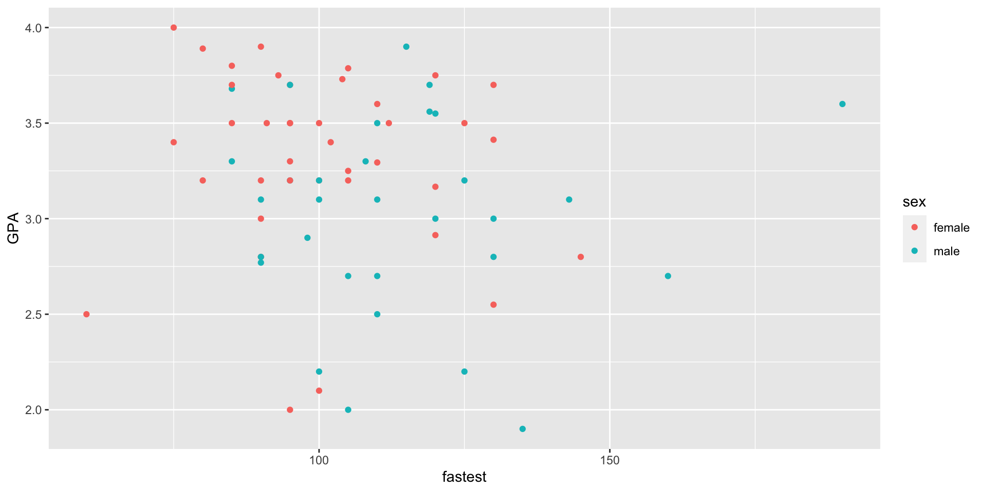
Example: m111survey Scatter Plot
In the m111survey graph, let’s represent each student (case) with a point.
The points are the glyphs.
- This time each glyph goes with one exactly one case.
- The x-coordinate is determined by the value of
fastestfor the case. - The y-coordinate is determined by the value of
GPAfor the case.
The Result: a Scatter Plot

Aesthetics
An aesthetic is a perceptible property of a glyph that varies from case to case.
We already know two aesthetics:
- location in the x-direction
- location in the y-direction
Some other possible aesthetics are:
- size
- color
- shape
Example: m111survey
Let’s use the color of each point to indicate the sex of the student.
We are mapping the aesthetic “color” to the variable sex.
The Result
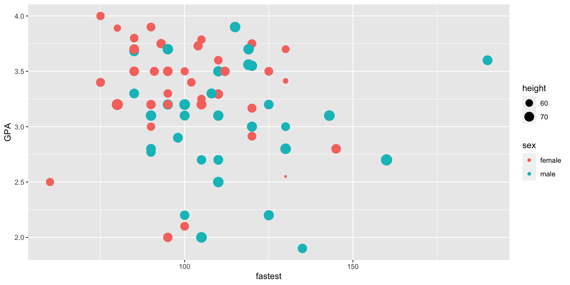
Another Aesthetic: Size
Let’s also map the aesthetic “size” to the variable height.
The Result
Scales and Guides
Scales
Scale
The relationship between the value of a variable and the graphical attribute to be displayed for that value.
Example: we mapped color to sex. R chose to set the value “female” to a reddish color, and the value “male” to a turquoise-blue color. That choice was the choice of a scale. (You can make R use a different scale if you like.)
Every aesthetic mapping involves a scale. R has default scales ready to use, if you don’t choose you own.
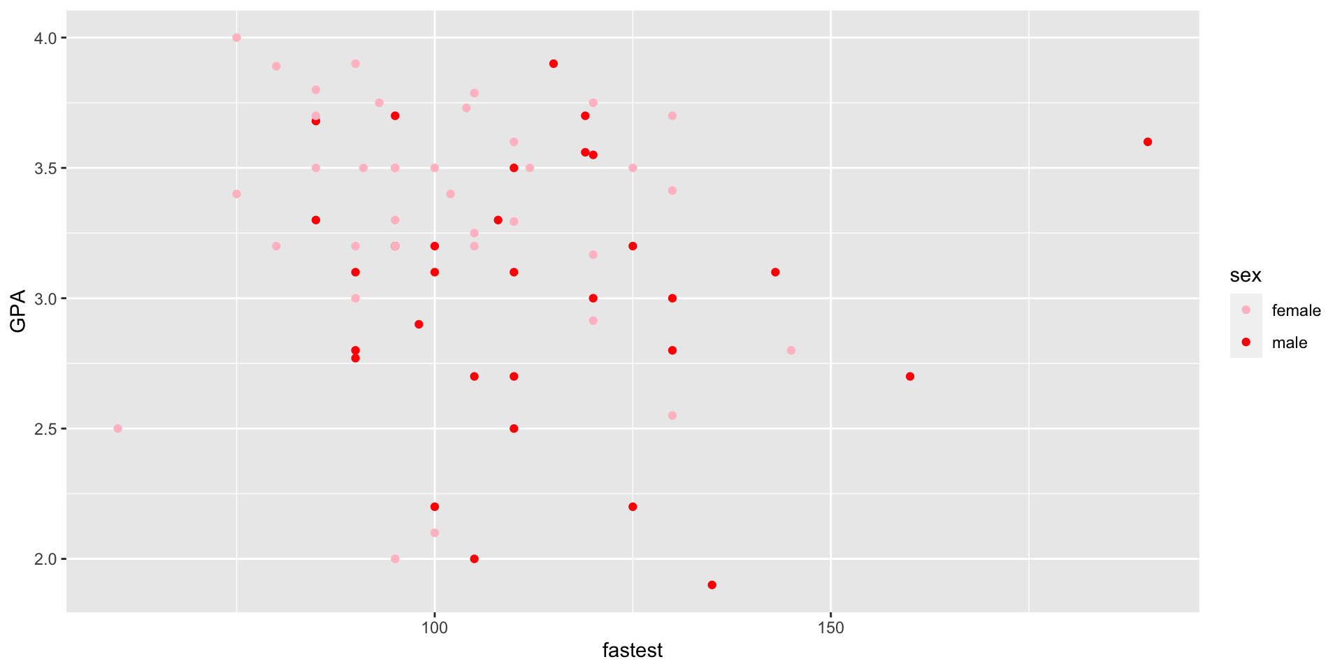
Example: Your Own Color Scale
This scale maps:
- “female” to pink
- “male” to red
The Result
Guides
Guide
An indication, for the human viewer, of the scale being used in an aesthetic mapping.
A guide takes you backwards: from the perceptual property to the data value it represents.
Examples of Guides
- Labels and tick-marks along the x-axis show you the scale for the x location aesthetic.
- Labels and tick-marks along the y-axis show you the scale for the y location aesthetic (if one is defined).
- Legends show guides for aesthetics such as color, size and shape.
Summary (for this plot)

- The glyphs are points.
- This time each glyph represents one and only one case.
- The frame is:
- x =
fastest - y =
GPA
- x =
- Other aesthetics are:
- color =
sex
- color =
- There are scales for the three aesthetic mappings above.
- The legend, axis labels, tick marks and hash-lines are the guides.
More Examples
Bar Glyphs
A bar graph of sex in m111survey:
Note:
- We used only one variable to define the frame. (R will guess what to do with the y-axis.)
- The glyphs will be bars.
The Result
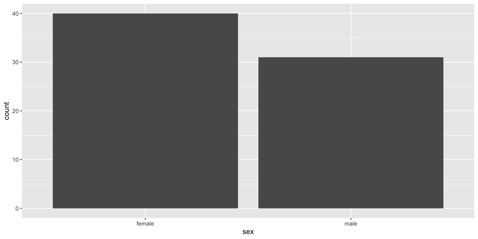
Some New things
- This time, each glyph corresponded to more than one case.
- All the female students helped determine the bar over “female” on the x-axis.
- All the male students helped determine the bar over “male” on the x-axis.
- R determined the height of the bars by counting up the number of students in each group.
- It guessed to do this because we did not map the y-aesthetic, and we asked for bars.
- The choice to count was the choice of a statistic.
- Sometimes one can ask R to use a statistic other than its default.
Sex and Feeling about Weight
Let’s map the aesthetic “fill” to weight_feel:
The Result
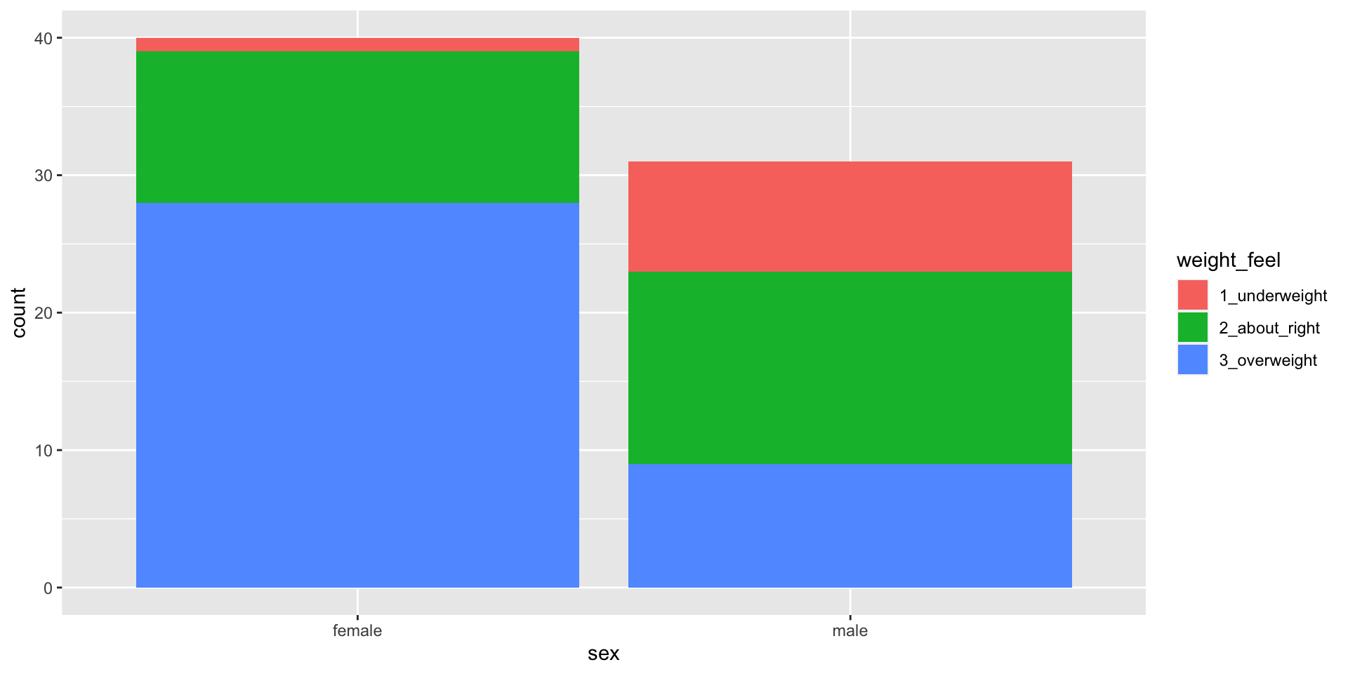
Practice
- How many glyphs are in the sex-and-weight bar graph?
- What aesthetics got mapped to what variables?
- What guides do you see?
Histograms
Question:
How are the fastest speeds driven distributed, for students in the
m111surveydata?
Let’s investigate with a histogram.

Histogram of the fastest speed ever driven.
In the Histogram
- The glyphs are rectangles. Each rectangle represents the cases in an interval of speed.
- The frame is:
- x-location maps to
fastest. - y-location is not part of the frame. (It represents a statistic: the height of a rectangle gives the number of cases that it represents.)
- x-location maps to
- There are no other aesthetics. (The burlywood fill is constant.)
- The scale for x-location maps \(x\) to
fastestin linear fashion - The x-axis has guides found for numerical variables.
Layering
- Many graphs have more than one type of glyph.
- This is called layering.
We can layer the histogram with a rug of jittered speeds.
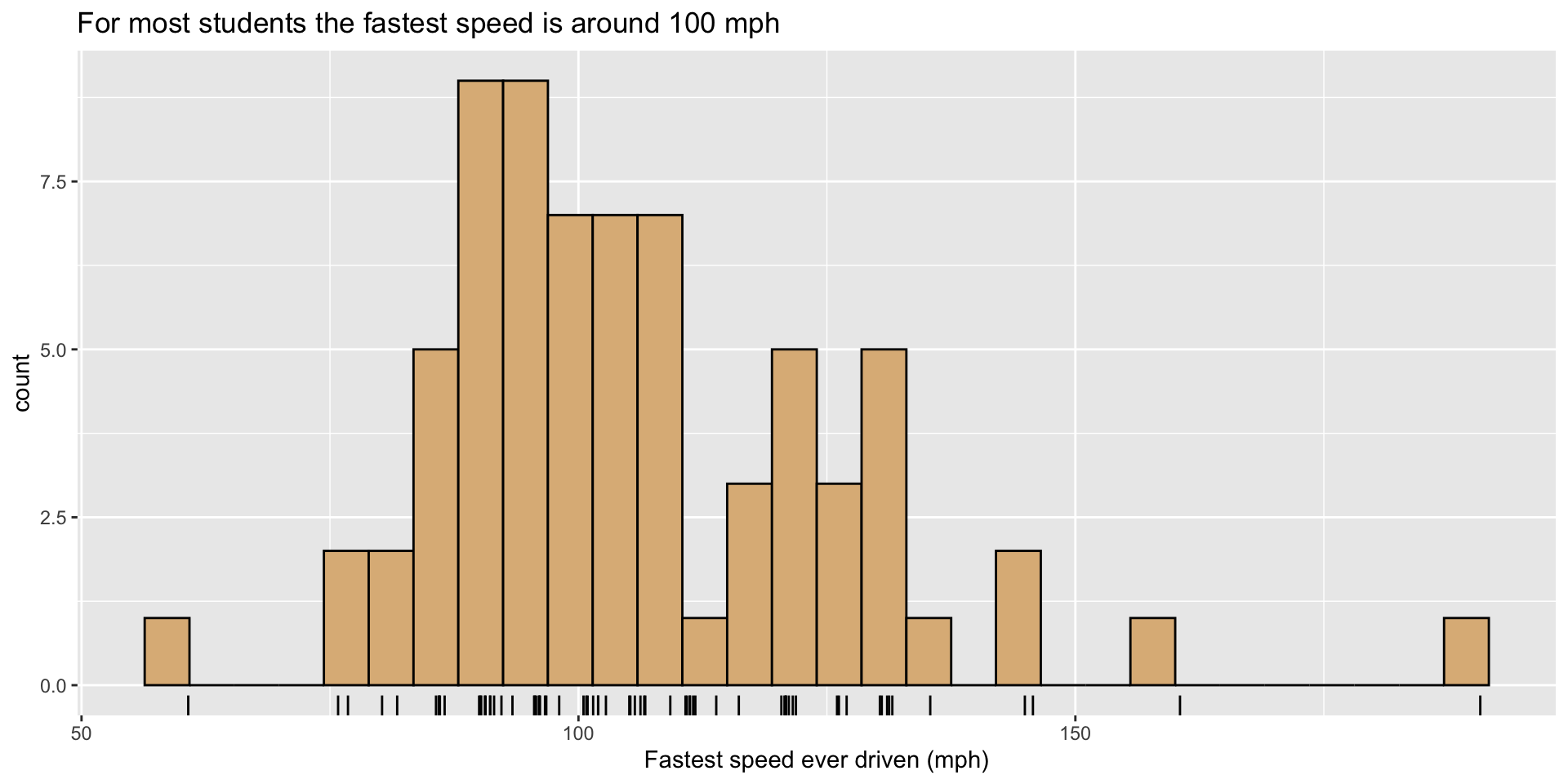
Histogram of the fastest speed ever driven.
Density-Curve Glyphs
- Density curves also describe the distribution of a numerical variable.
- They are a good alternative to histograms.
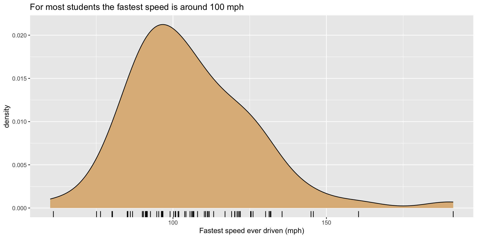
Density plot of the fastest speed ever driven.
Numerical and Categorical Variable
Question:
Is there a relationship between seating preference and the fastest speed ever driven?
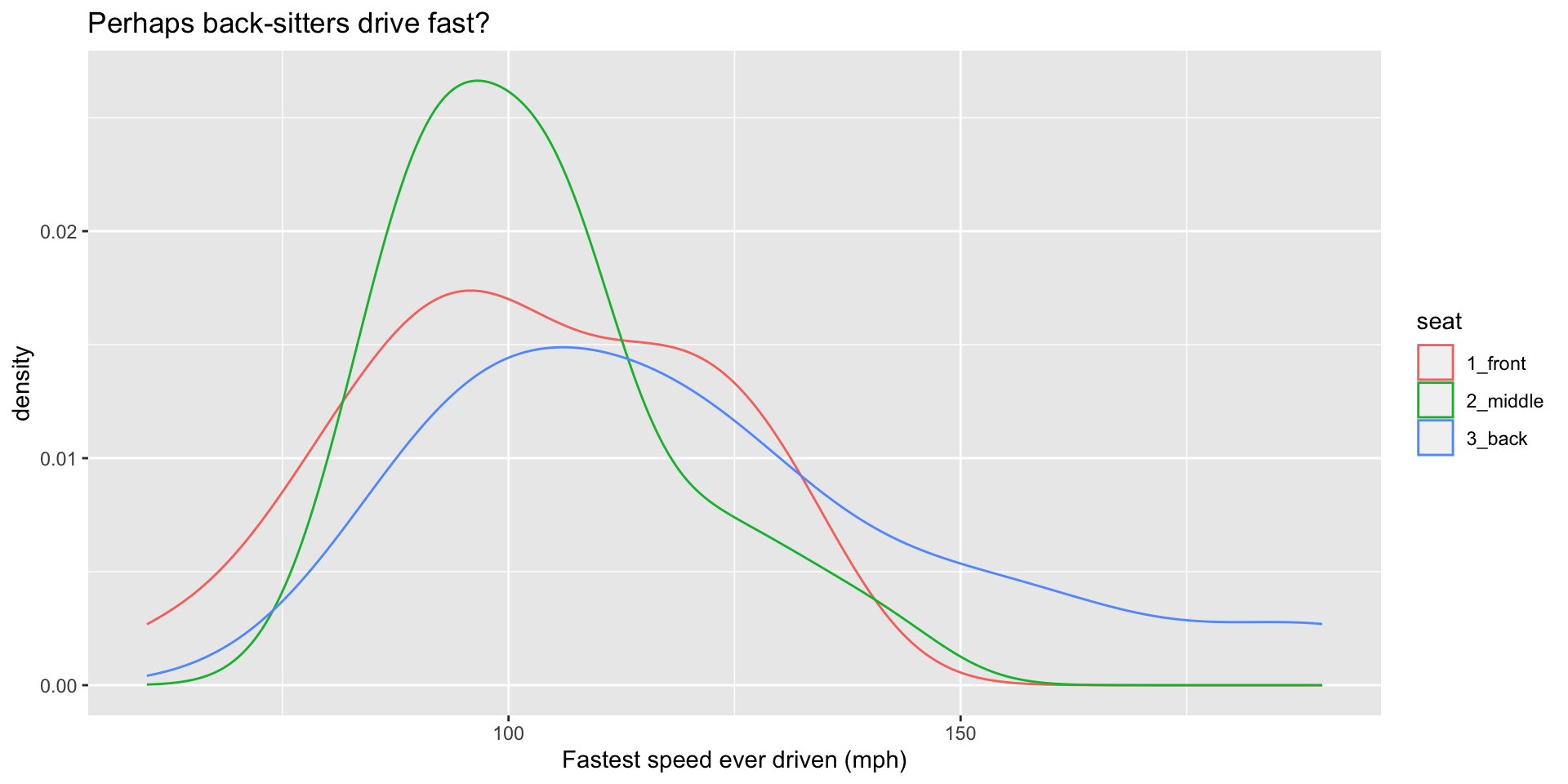
Density plot of the fastest speed ever driven.
In This Plot
- Frame is x-location (mapped to
fastest) - Another aesthetic was color (mapped to
seat) - Glyphs are the density curves (representing the cases for each value of
seat) - What guides do you see?
Violin Plots
These are a good alternative to density plots, especially when studying the relationship between a numerical variable and a categorical variable.
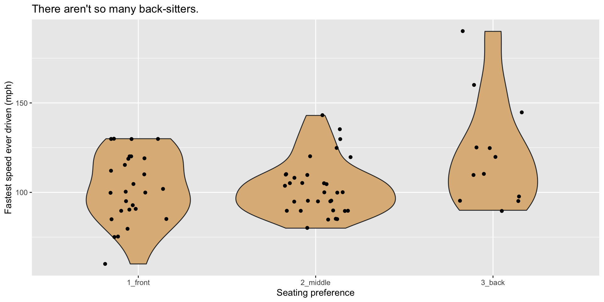
Violin plot of the fastest speed ever driven.
Box-and-Whisker Glyphs
These are useful in about the same range of circumstances as violin plots.
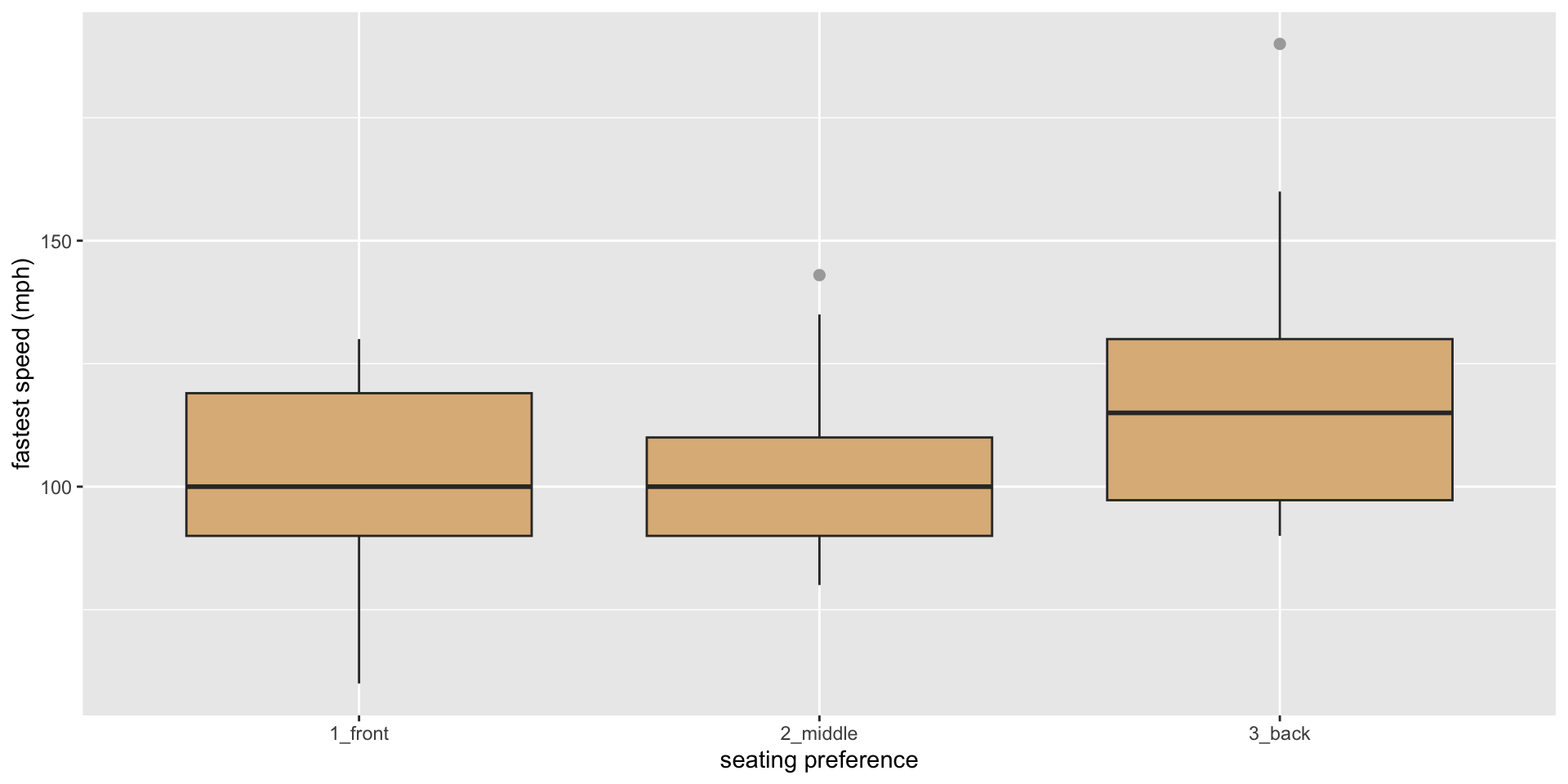
What the Plots Mean
In a list of values:
- the first quartile \(Q_1\) is a number that has about 25% of the values less than it
- the third quartile \(Q_3\) is a number that has about 75% of the values less than it
- \(Q_1 - Q_3\) is called the interquartile range (IQR).
- the median is a number that has about 50% of the data below it
\(Q_3 - Q_1\) is called the interquartile range (IQR).
Box-and-Whisker I
When there are no outliers:
- lower whisker goes from minimum value to \(Q_1\) (extends along lowest 25% of the values)
- box from \(Q_1\) to \(Q_3\) shows middle 50% of the values
- the median is the line inside the box
- upper whisker goes from \(Q_3\) to the maximum value (extends along highest 25% of the values)
Box-and-Whisker II
- If a value is bigger than \(Q_3 + 1.5 \times IQR\) then it is plotted individually as an outlier.
- Then the upper whisker goes from \(Q_3\) to the highest value that is not an outlier.
- If a value is less than \(Q_1 - 1.5 \times IQR\) then it is plotted individually as an outlier.
- Then the lower whisker goes from \(Q_1\) to the lowest value that is not an outlier.
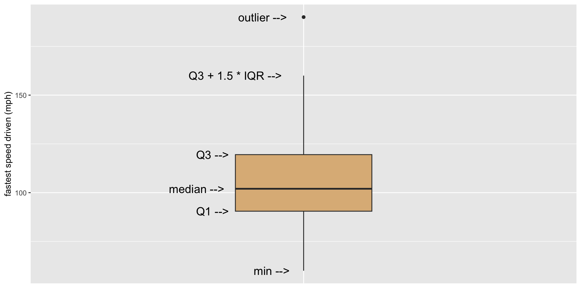
Illustration of a simple box plot.
Choropleth Maps
- choropleth: from the Greeks words “choros” (region) and “plethos” (a multitude)
- A choropleth graph is a graph in which the frame is provided by some sort of map with regions that might be:
- countries
- cities in the U.S.
- counties in the U.S.
- any other type of regions
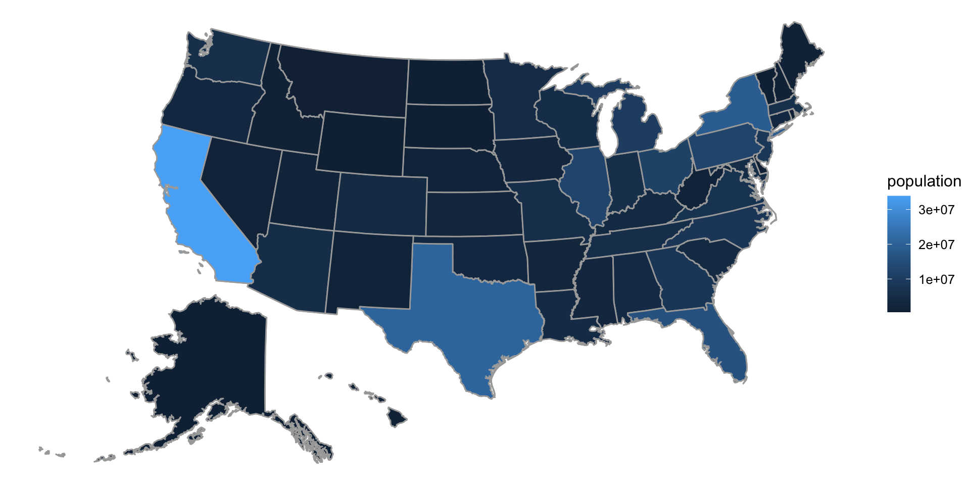
Choropleth map of state populations in the U.S.
Facets
Making Facets
- Sometimes it is useful to split out your graphs into separate plots.
- This enables you to incorporate more variables into your study.
Question:
How does fastest speed drive relate to sex and to seating preference?
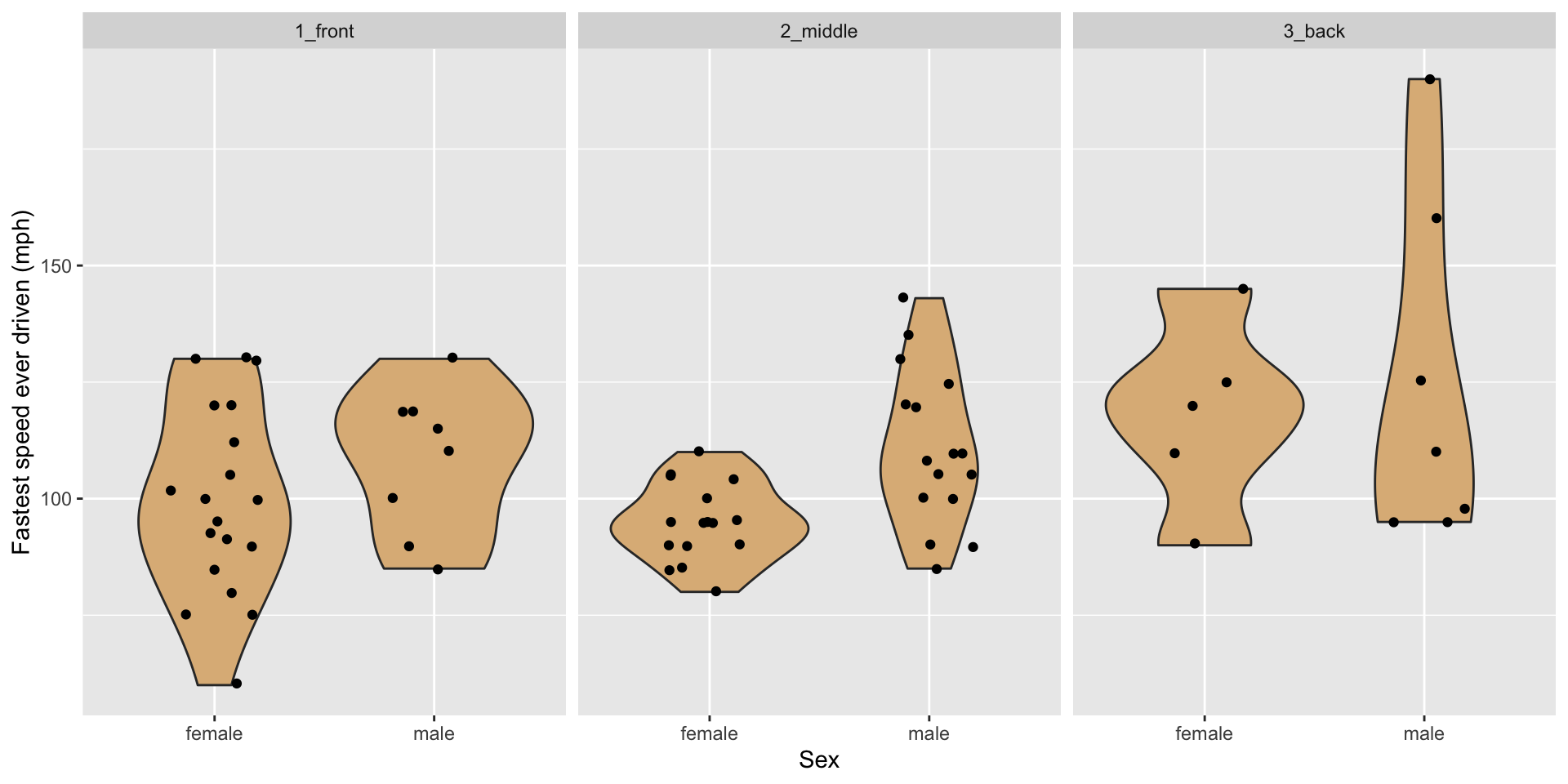
Violin plots of the fastest speed ever driven, by sex and seating preference.
In This Plot:
- Frame: x-location mapped to
sex, y-location mapped tofastest. - Glyphs are of two types: violins and jittered points.
- Other aesthetics: none.
- Facet-ing by
seat.