Graphing with ggplot2

(Section 8.2)

Load Packages

Make sure the packages we will use are loaded:

library(ggplot2)
library(bcscr)
library(mosaicData)

First Graph Goal

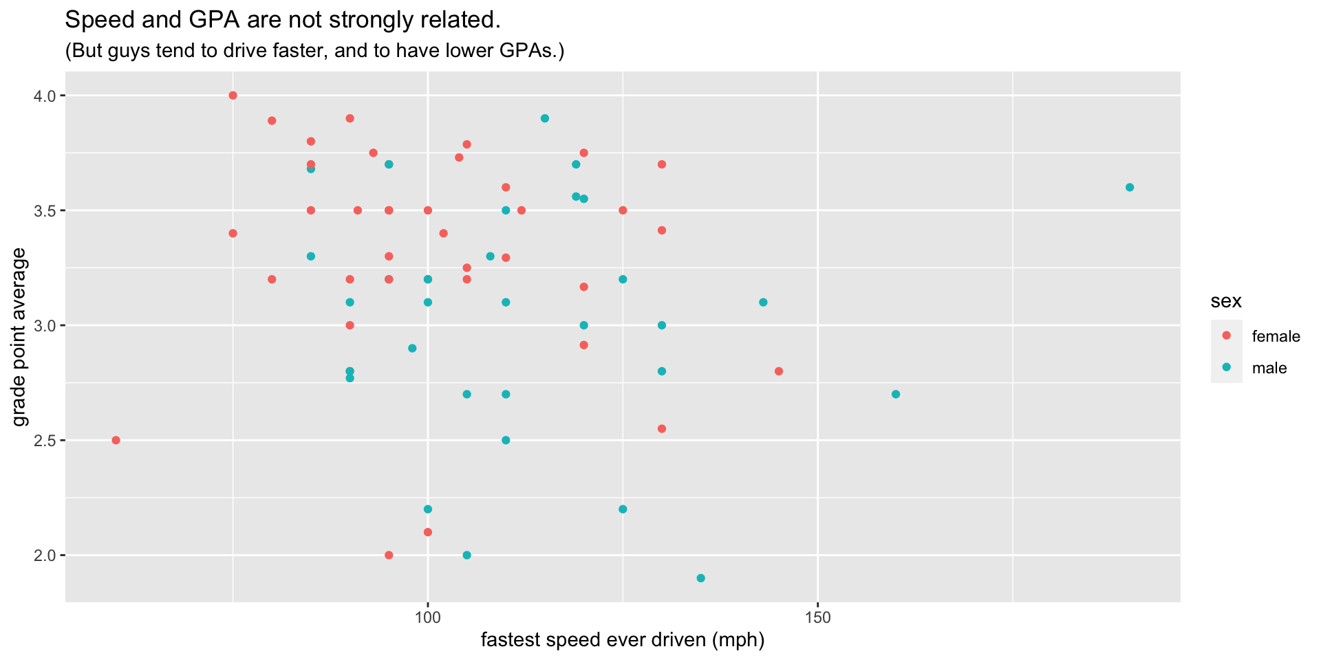
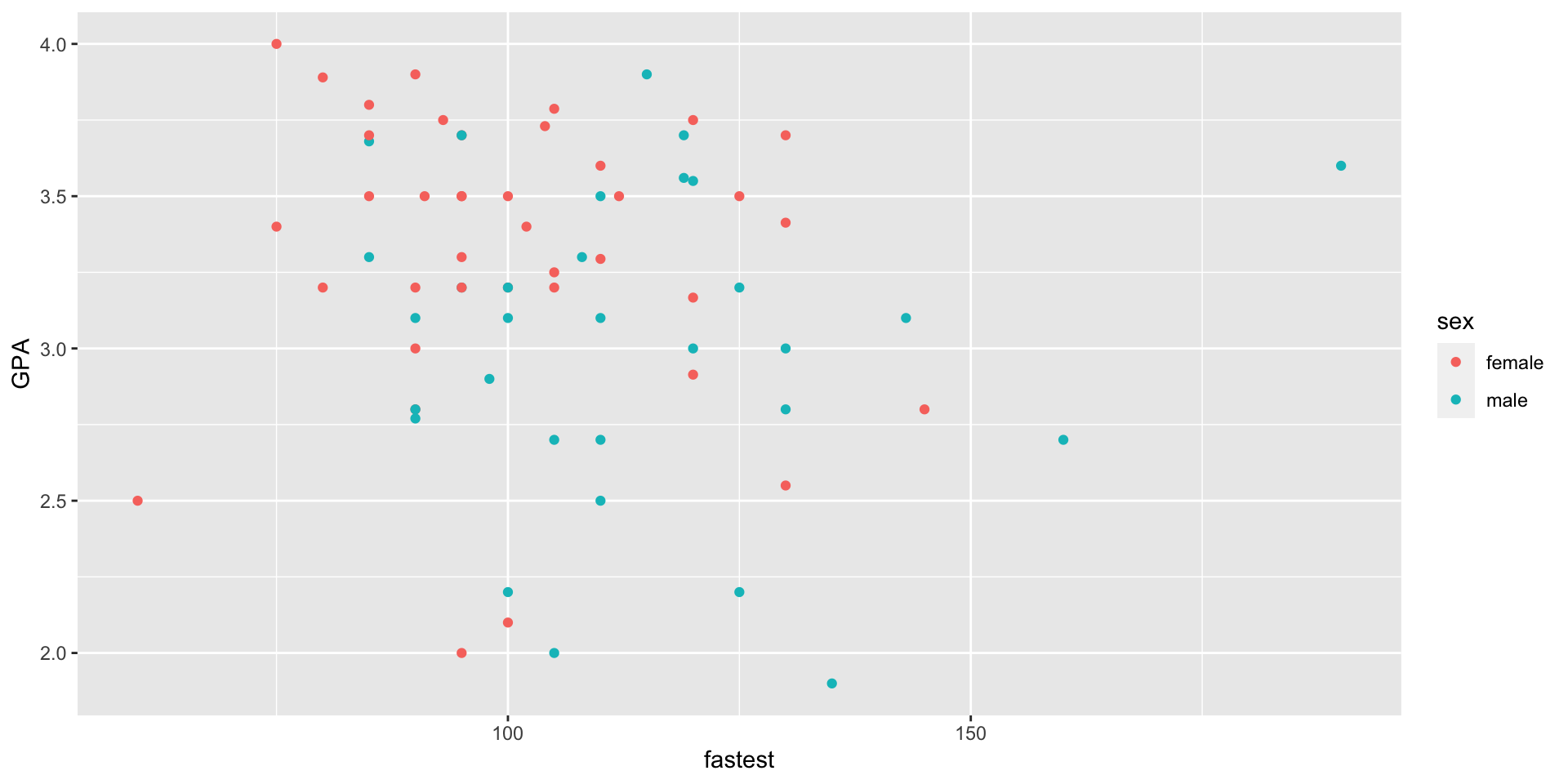
We want to build this scatter plot with ggplot2.

The Frame

Build from a Data Frame

Start with the ggplot().

ggplot(data = m111survey)

All variables involved in the plot will come from data.

Blank (for now!)

Establish the Graph Frame

Map x and y location to variables.

ggplot(
  data = m111survey,
  mapping = aes(
    x = fastest, 
    y = GPA
  )
)

Axes set up, but still no points.

Skip Naming the Parameters

Most people don’t name the parameters for ggplot(), they just put the arguments in the right order:

ggplot(m111survey, aes(x = fastest, y = GPA))

Adding Glyphs

General Form

The general form is:

geom_gylphType()

Thus we have such things as:

  • geom_point() for points;
  • geom_bar() for the bars of a bar graph;
  • geom_histogram() for the rectangles that make up a histogram;
  • geom_density() for the curve of a density plot;
  • geom_violin() for the violins of a violin plot;
  • geom_jitter() for jittered points representing individual cases;
  • geom_rug() for rug-ticks representing individual cases;

And many more!

Add Point Glyphs

ggplot(m111survey, aes(x = fastest, y = GPA)) +
  geom_point()

Adding Aesthetic Mappings

Mapping New Aesthetic Properties

x and y-location are aesthetic properties mapped to variables when we make the frame.

You can map other aesthetic properties, such as color.

Add a Mappng to Color

ggplot(m111survey, aes(x = fastest, y = GPA)) +
  geom_point(aes(color = sex))

Adding Labels

Label your axes, providing units if you have them.

Add Labels

Expand to see code
ggplot(m111survey, aes(x = fastest, y = GPA)) +
  geom_point(aes(color = sex)) +
  labs(
    x = "fastest speed ever driven (mph)",
    y = "grade point average",
    title = "Speed and GPA are not strongly related.",
    subtitle = "(But guys tend to drive faster, and to have lower GPAs.)"
  )

Aesthetic Mappings vs. Fixed Properties

A Fixed Property

ggplot(m111survey, aes(x = fastest, y = GPA)) +
  geom_point(color = "blue")

The color-setting is not wrapped in a call to aes(). All points will be blue, no matter what the data says, so here color is NOT an aesthetic.

Examples of Fixed Properties, for Points:

Code Effect
geom_point(color = "blue") all the points are blue
geom_point(shape = 22) all points are solid squares
geom_point(size = 3) all points are bigger than default size (1)

(Or you can aesthetically map these properties!)

  • geom_point(aes(color = sex))
  • geom_point(aes(shape = sex))
  • geom_point(aes(size = height))

Bar Plots

Use bar plots to study categorical variables.

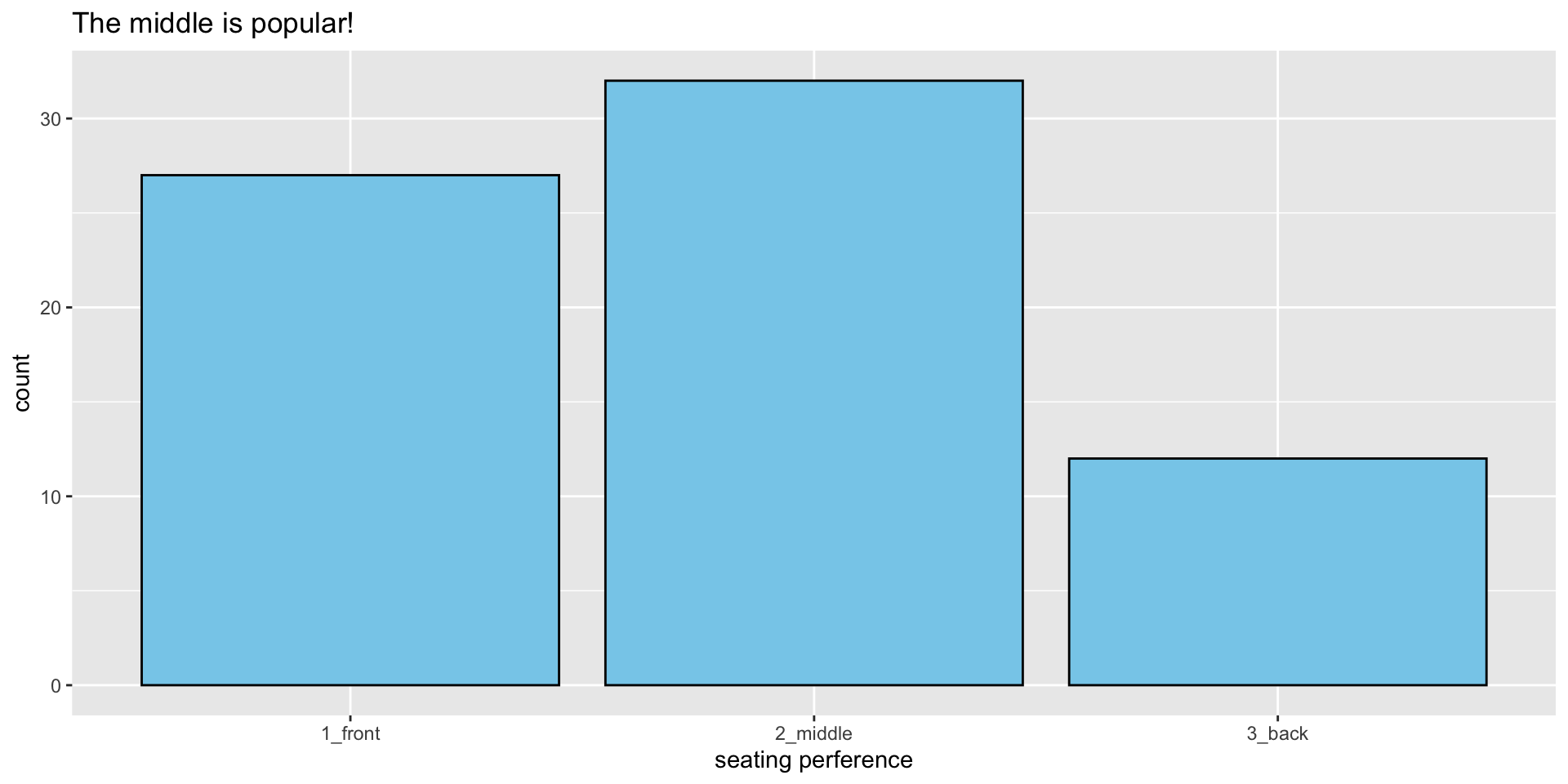
Distribution of seat

Expand to see code
ggplot(m111survey, aes(x = seat)) +
  geom_bar(color = "black", fill = "skyblue") +
  labs(
    x = "seating perference",
    title = "The middle is popular!"
  )

seat by sex

Expand to see code
ggplot(m111survey, aes(x = sex)) +
  geom_bar(color = "black", aes(fill = seat)) +
  labs(
    x = NULL,
    title = "Front is more popular among females."
  )

Dodging

Expand to see code
ggplot(m111survey, aes(x = sex)) +
  geom_bar(
    color = "black", 
    position = "dodge",
    aes(fill = seat)) +
  labs(
    x = NULL,
    title = "Front is more popular among females."
  )

Density Plots

Fastest Speed Ever Driven

Make a density plot of fastest speed ever driven:

ggplot(m111survey, aes(x = fastest)) +
  geom_density(fill = "burlywood")

Violin Plots

Fastest Speed, by Sex

We’ll make violin plots, and layer on jittered points:

ggplot(m111survey, aes(x = seat, y = fastest)) +
  geom_violin(fill = "burlywood") +
  geom_jitter(width = 0.25)

Facets

  • break data into groups
  • separate plot for each group
  • but the plots are arranged nicely together in one graph

Two Ways to Facet

ggplot2 has two functions for splitting a plot into facets:

  • facet_grid()
  • facet_wrap()

Investigate

Let’s investigate facet-ting while looking at some new data:

library(bcscr)
?railtrail

Our aim:

Study how season and dayType relate to volume (the number of people who use the trail on a given day).

head(railtrail)
  hightemp lowtemp avgtemp cloudcover precip volume weekday dayType season
1       83      50    66.5        7.6   0.00    501    TRUE weekday summer
2       73      49    61.0        6.3   0.29    419    TRUE weekday summer
3       74      52    63.0        7.5   0.32    397    TRUE weekday spring
4       95      61    78.0        2.6   0.00    385   FALSE weekend summer
5       44      52    48.0       10.0   0.14    200    TRUE weekday spring
6       69      54    61.5        6.6   0.02    375    TRUE weekday spring

Facet Grid, Tke One

ggplot(railtrail, aes(x = volume)) +
  geom_density(fill = "burlywood") +
  facet_grid(season ~ dayType)

Hmm, difficult to compare across a row.

Facet Grid, Take Two

Let aesthetic mapping do some of the work:

expand to see code
ggplot(railtrail, aes(x = dayType, y = volume)) +
  geom_boxplot(fill = "burlywood") +
  facet_grid( . ~ season) +
  labs(x = "Time of Week") +
  theme(
    legend.position = "top", 
    legend.direction = "horizontal"
  )

Facet Wrap

Use facet_wrap() when you want to split up by categorical variable that has lots of values.

?CPS85

Let’s study the ages of employees in the various sectors of employment.

Facet Wrap Code

ggplot(CPS85, aes(x = age)) +
  geom_density(fill = "burlywood") +
  facet_wrap(~ sector, nrow = 3)

Alternative to Facets

Sometimes more aesthetic mapping is better:

ggplot(CPS85, aes(x = sector, y = age)) +
  geom_boxplot(fill = "burlywood")

A Few Final Points

Customize!

Use named colors from colors() to customize your plots:

ggplot(CPS85, aes(x = sector, y = age)) +
  geom_boxplot(fill = "skyblue")

A Common Error: Failure to aes()

Trying to aesethetically map color to sex, this won’t work:

ggplot(m111survey, aes(x = fastest, y = GPA)) +
  geom_point(color = sex)
Error in layer(data = data, mapping = mapping, stat = stat, 
geom = GeomPoint, : object 'sex' not found

Remember to aes()

ggplot(m111survey, aes(x = fastest, y = GPA)) +
  geom_point(aes(color = sex))

Tweaking With Programming

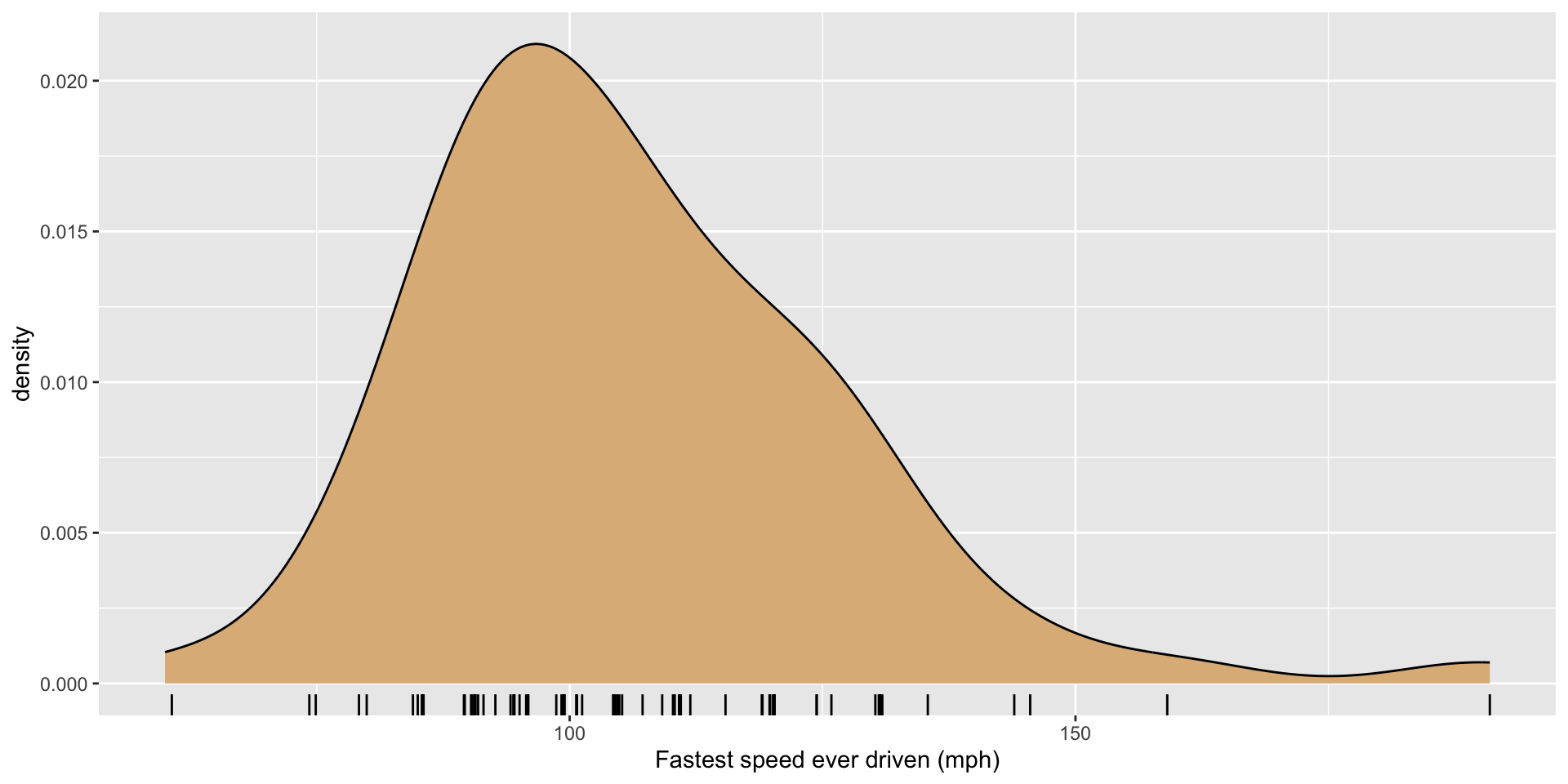
Recall this density plot with rug:

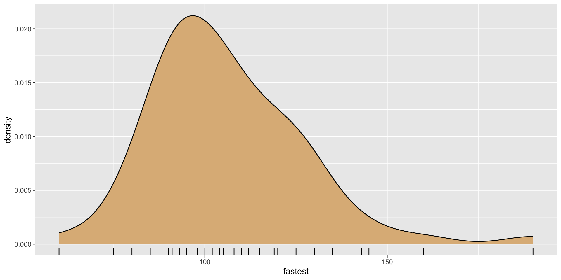
The rug-ticks over-plot each other. How to fix this?

The Fix

Create a new variable of randomly-jittered speeds:

n <- nrow(m111survey)
jitters <- 
  runif(
    n,
    min = -1, 
    max = 1
  )
m111survey$jitteredSpeeds <- m111survey$fastest + jitters

Each “jittered” speed is the true speed \(\pm\) a random real number up to 1.

Now Plot

ggplot(m111survey, aes(x = fastest)) + 
  geom_density(fill = "burlywood") +
  geom_rug(aes(x = jitteredSpeeds)) +
  labs(x = "Fastest speed ever driven (mph)")